THREE ELEMENTS
TO CONSIDER WHEN DESIGNING
YOUR NEXT PRINT CAMPAIGN


PAPER: Selecting the right stock can be a great way to make your campaign stand out. Glossy stocks will add more appeal to photographs in your direct mailer, while matte finishes create a more understated and classic look. A more recent material, “soft touch,” is a laminate that has a soft and smooth suede feeling when in hand. Added textures bring a whole new dimension to your mailer, keeping your ad one step ahead of the competition.

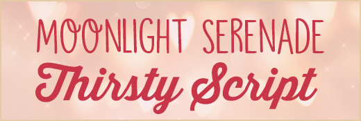
FONTS: Typography is imperative to highlight key points and draw consumer attention. Recent trends show script and hand written type fonts are becoming increasingly popular in consumer campaigns. “Moonlight Serenade” and “Thirsty Script” may be prime candidates for your next direct mail piece.

COLOR: Temperature will influence consumer perception of your ad. Clean and earthly color palettes can convey a peaceful and holistic message, blues can be seen as traditional and technical, while reds are typically chosen to stand out and represent energy and joy. Matching the right colors to the mood and tone of your brand will give consumers a much deeper understanding of your product’s image.


Follow Us!